Hi, I'm
Grace — Caroline Grace Alexander, Senior User Researcher
I’m a mixed methods user researcher with a background in Computer Science. I help teams frame the right problems, answer critical questions, and create thoughtful products.
Projects
I'm a Senior User Researcher at Apple.
I'm curious about people and systems.
I'm drawn to experimentation and iterative ways of working at Apple and outside of it. Here are some examples from my personal work that reflect how I think and create.
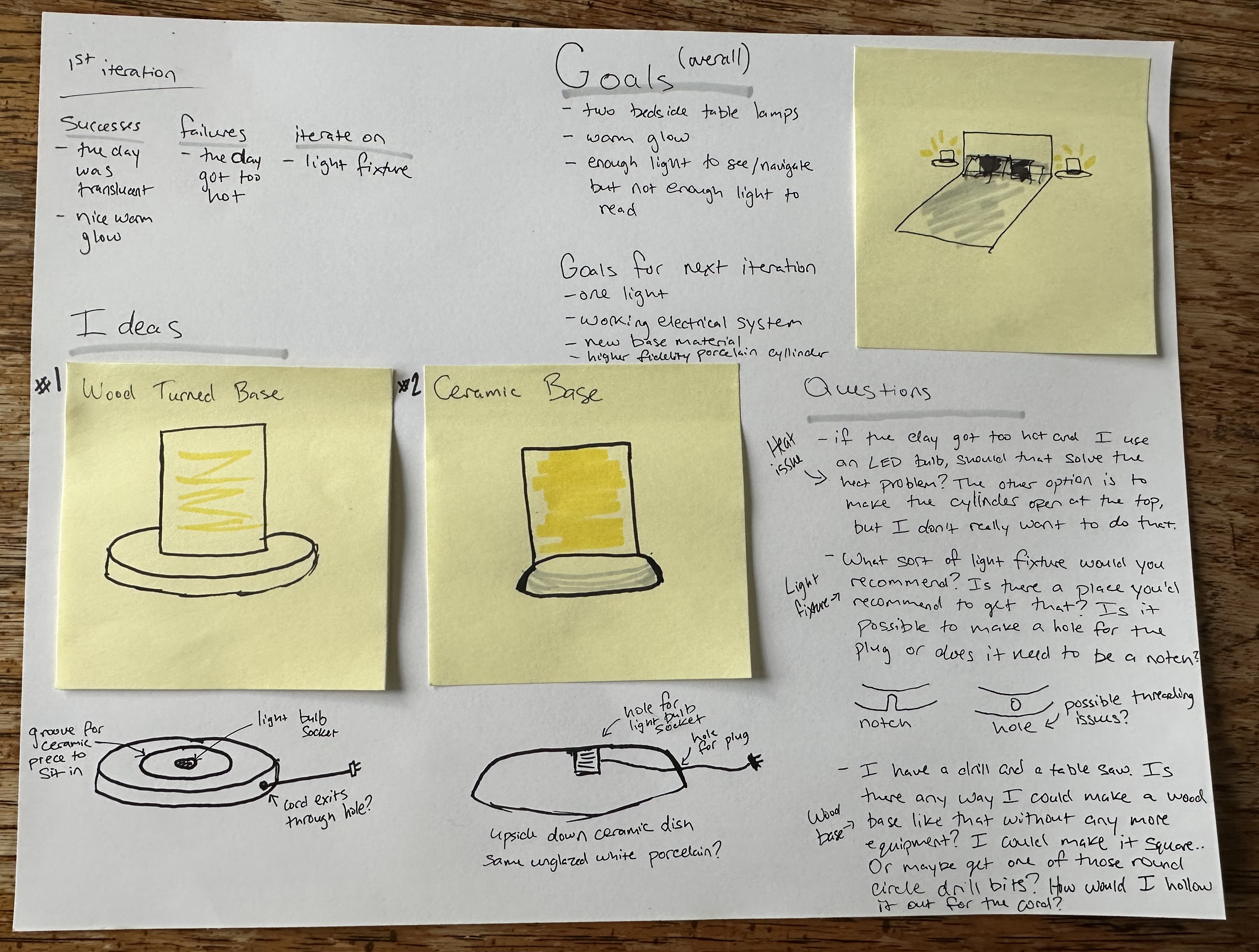
Design Through Constraints.
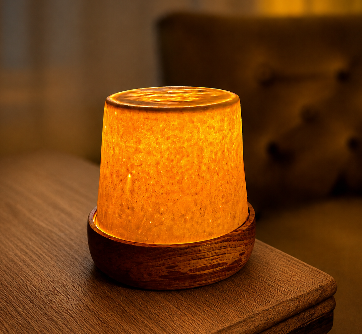
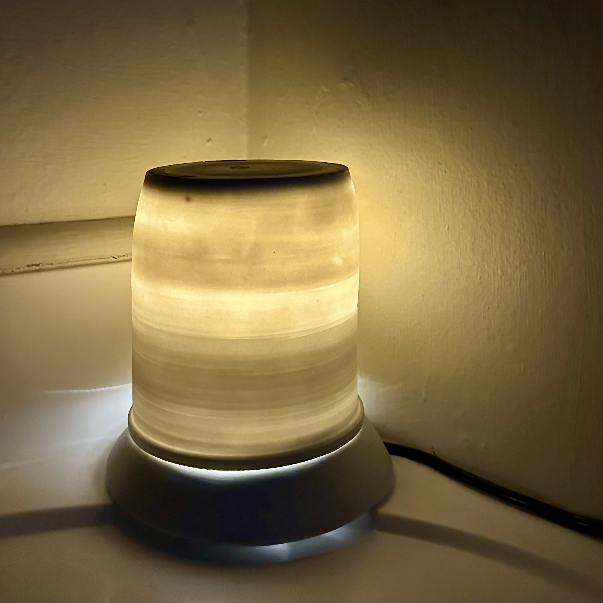
A two-year material study in translucent porcelain. A lamp no one had made before, iterated toward a reproducible process.
About the project
I was living in an old San Francisco apartment with warm, flattering light. Most of it came through frosted glass fixtures and incandescent bulbs. I wanted to recreate that warm, atmospheric glow with a ceramic light.
I'd heard that porcelain, thrown thin enough, can be translucent. That became the starting point: two years of making, testing, and iterating toward a ceramic light cover that glows.
Prove the Concept
The first question was whether porcelain could be thrown thin enough to let light through. I made a test piece, and it worked. The translucency was clear, and the concept held.
You can see here my test piece placed on top of a light fixture in my house.
Develop a Plan
With the concept proven, I sketched out a plan. I needed to figure out how to fit the lighting component inside the piece, how the parts would connect, and how to make it sit flat on a surface. The goal was a fully standalone lamp, one self-contained object you could plug in and use.
Initial Design
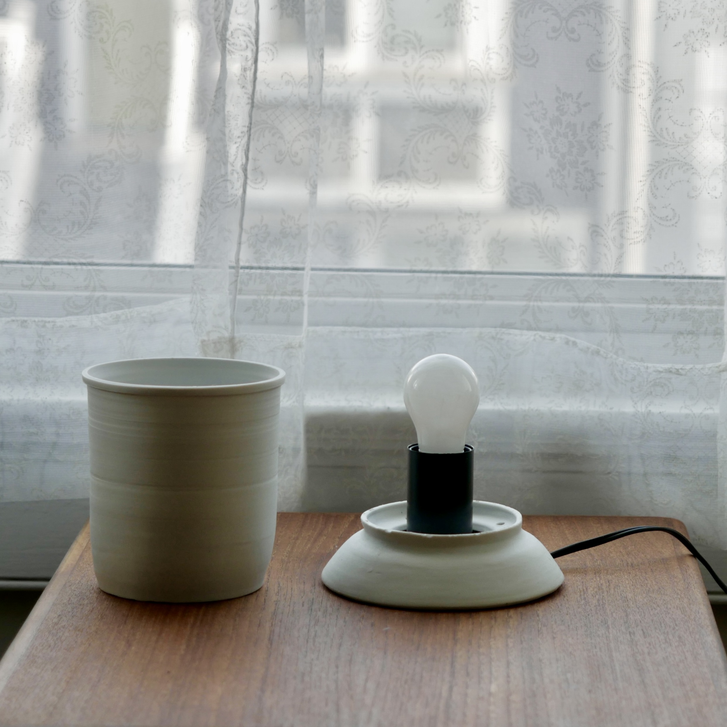
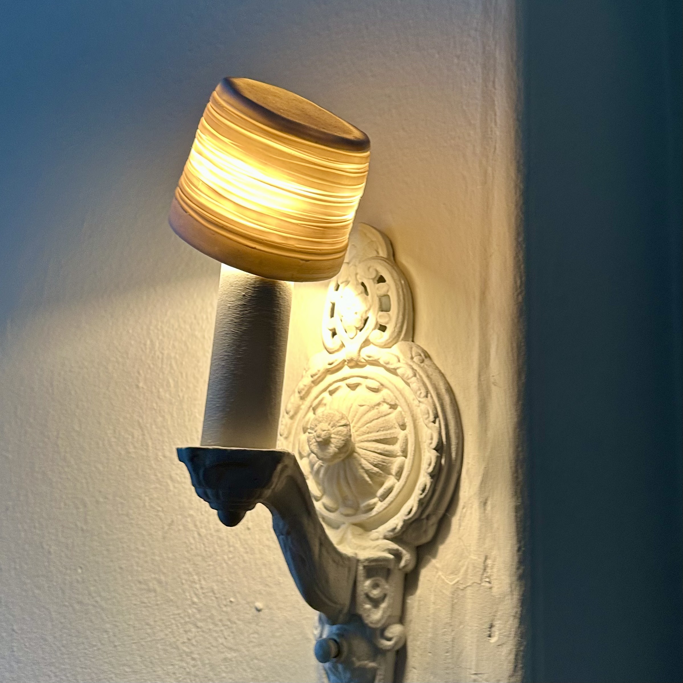
The first version captured the overall look, but had significant structural problems. The light fixture sat separately from the rest of the piece, the cord exit felt unresolved, and the components didn't come together as one. Only about one in every five shade attempts came out properly translucent.
Iterate on the Shade
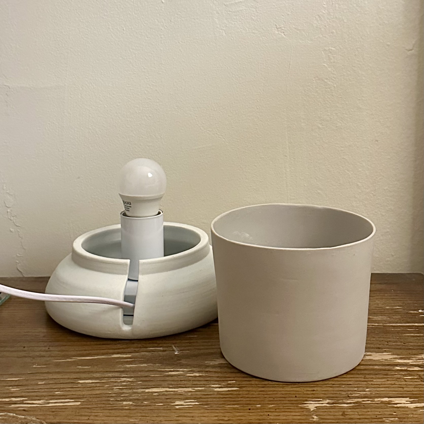
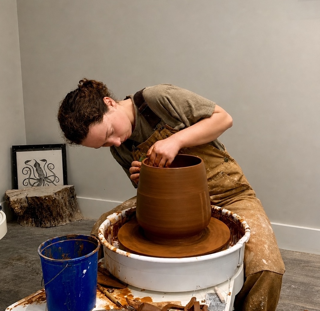
After trying hand building, carving, and other methods, I landed on slip casting. I threw the lampshade form on the wheel, made a plaster mold from it, and used the mold to cast extremely thin porcelain shells. I also took a slip casting class to learn the technique properly.
Traditionally, slip is left in a mold for 30–40 minutes to build up the walls. For these, I pulled it at five. That's well outside the standard parameters of the method, but it was the only way to get the walls thin enough to glow.
Iterate on the Base
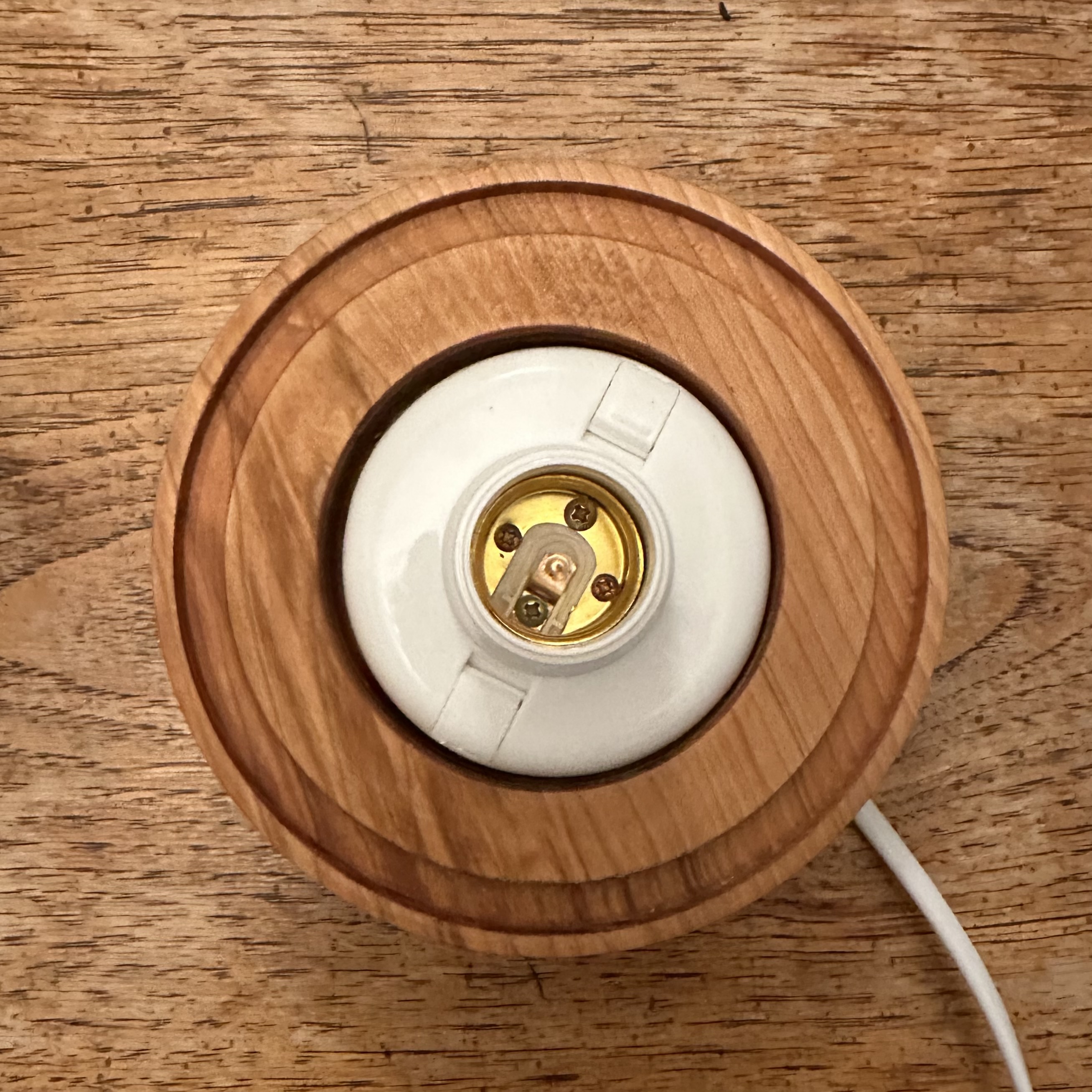
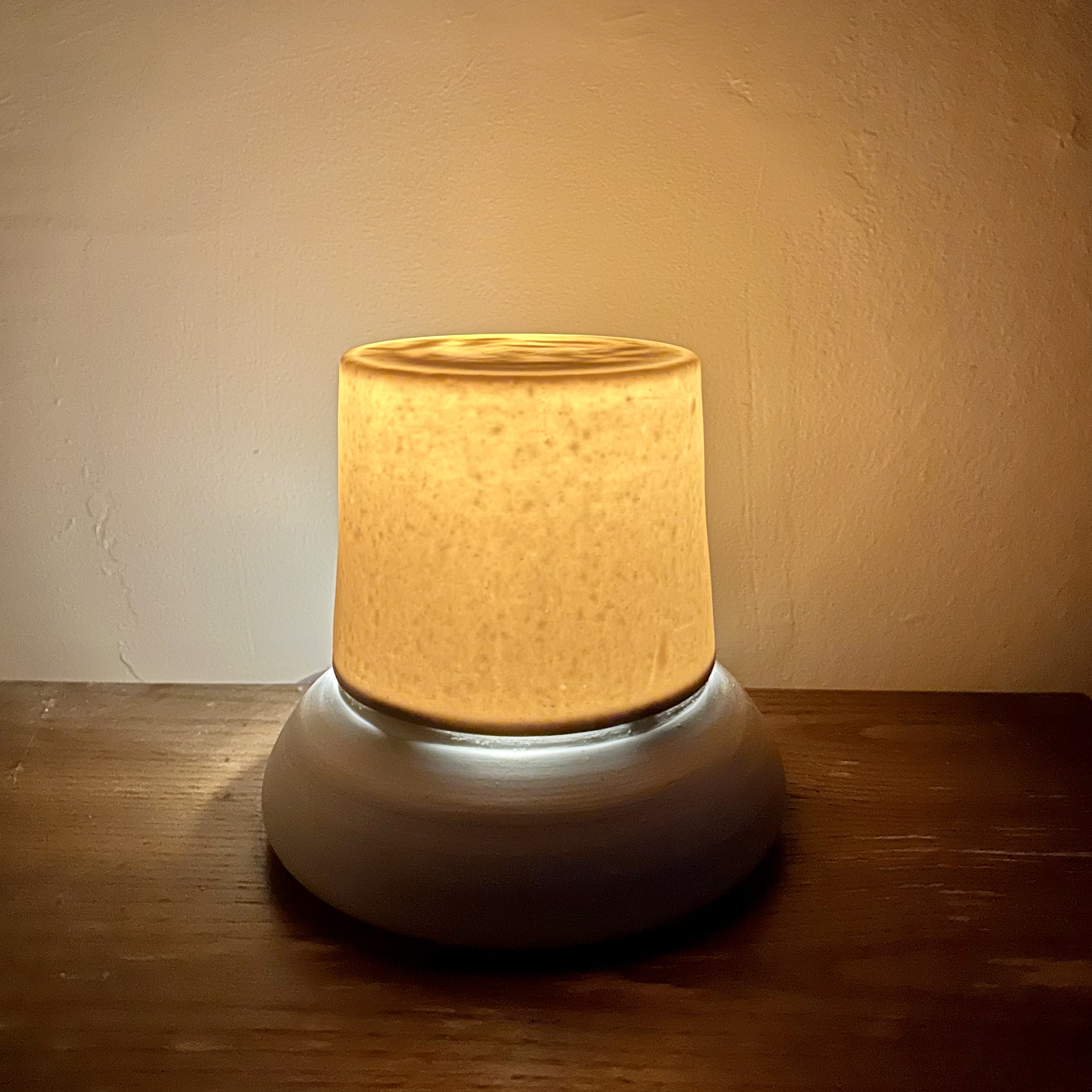
While I'm most comfortable with the ceramic medium, it was time to try a new medium that could solve some of the issues a ceramic base introduced. I took a wood carving class, learned to use the lathe, and switched the base to wood. Wood made it straightforward to install the lamp hardware and drill a clean hole for the cord, both of which had always been messy in ceramic.
The bigger gain was fit. With a wood base, I could bring the fully fired shade to the lathe and carve the groove to match it exactly. I test-fitted the shade as I went, shaving a little more until it sat properly. The shrinkage problem went away.
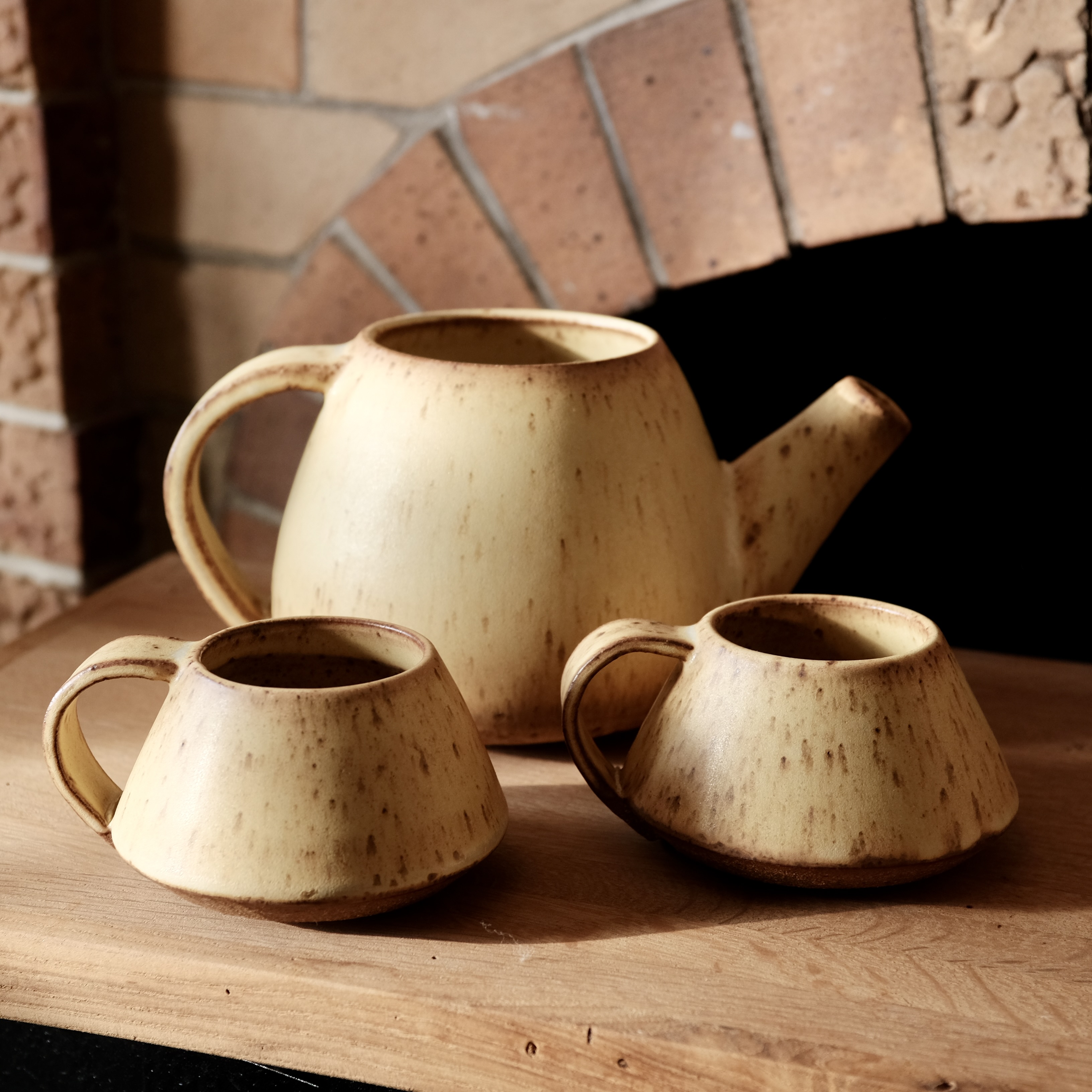
Slip casting for the shade, wood turning for the base. After two years of experimentation, I had a consistent, replicable method for making the light.
The Empathy Interviews.
A research pilot exploring everyday emotions, designed to help people feel seen and curious about each other.
About the project
I've always been curious about what other people's lives actually feel like from the inside.
This project is a research pilot designed to surface those feelings, help people feel seen in their everyday emotional experiences, and build curiosity about the lives of others.
Designing the five questions took real care. Each one had to be open enough that participants could take it anywhere — no specific emotions named, no examples that might anchor their thinking. I wanted each person to describe their own experience in their own words, without being steered toward what I expected to hear.
I piloted the study with people I know before expanding to strangers. Even in the pilot, the range of feelings people named surprised me. I'd expected more overlap with my own experience. The variety was a useful reminder of how differently we each move through the world.
The questions
Tell me about your day so far today — what's happened?
Is there a feeling you've been feeling a lot recently?
Tell me about a time recently when you felt that way.
How do you feel about the role that feeling plays in your life?
In the future, what do you want your relationship to that feeling to look like?
Next steps
Take the questions to strangers! Interviewing people I don't know will be a different challenge. I'm curious what feelings come up, and whether I can create the same sense of comfort with someone I've never met.
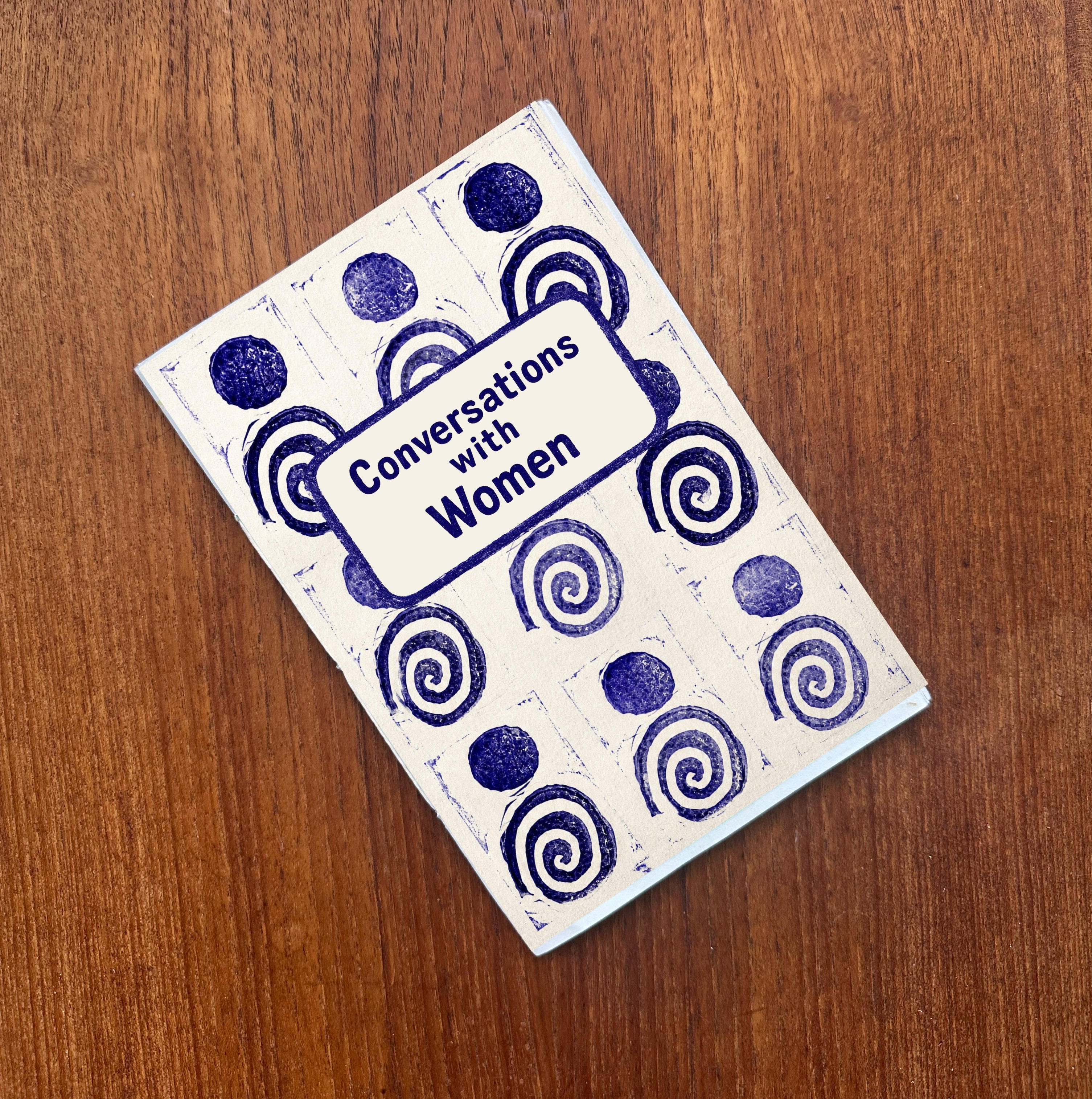
The zine
Full interviews coming soon.
The AI Design Experiment.
I replaced the product team with AI and kept real usability testing in the loop. It created a usable app.
The idea
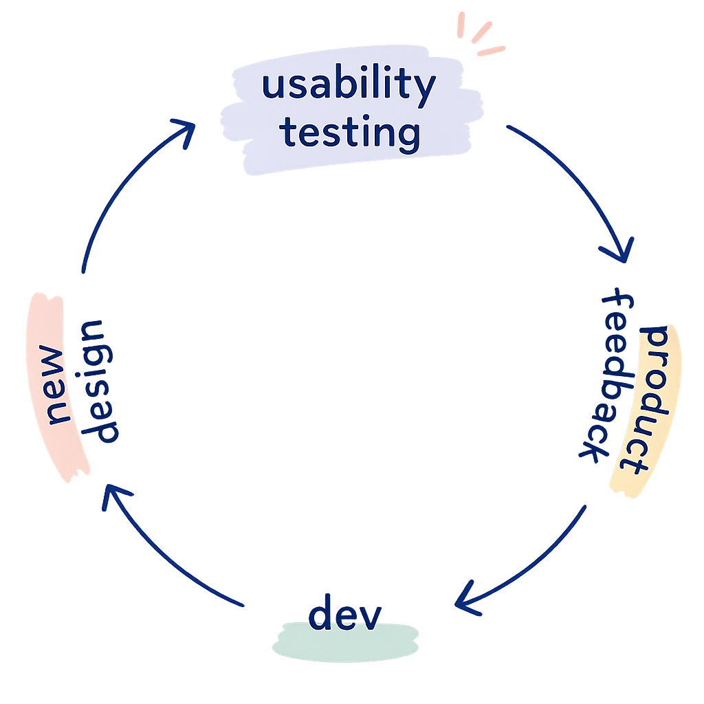
This project explores what happens when AI and usability testing are connected in a closed loop with no designer or developer in the middle. The premise is simple: an AI generates a prototype, real users test it, and their feedback goes straight back into the AI to generate the next version.
Tools like UserTesting.com already let you connect to users on demand. In a fully realized version of this loop, a design could go from prototype to tested to revised without a human decision point in between. Because usability testing can be run quickly and repeatedly, this kind of loop could dramatically accelerate iteration.
I believe humans should be in the loop with AI. This project is a deliberate experiment to see what happens when they're not.
The result
My takeaway
It took more iterations than I expected, but the loop produced a working app.
- Claude optimized for the feedback it received rather than design best practices. It gave users what they asked for, not what a skilled designer would know to do from the start.
- It didn't weigh findings by frequency; one user's feedback carried the same weight as three.
- Users could complete every task, but this experiment shows usable and well-designed aren't necessarily the same thing.
I was impressed with the output. I think one of the main limiting factors was the lightweight prompts I used. With more prompt structure around how to weigh and incorporate findings, the loop could get to a usable point faster and more reliably.
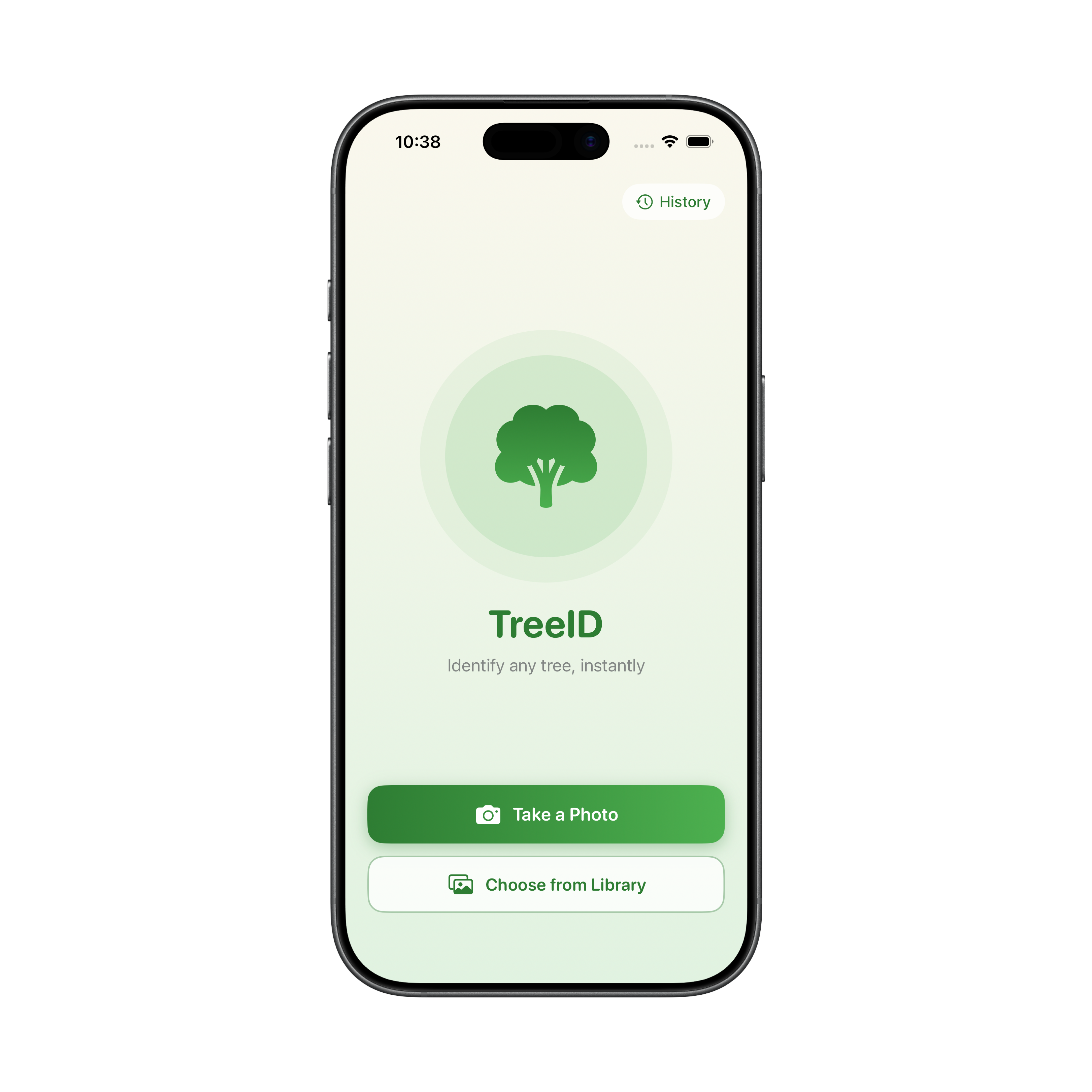
Iteration One
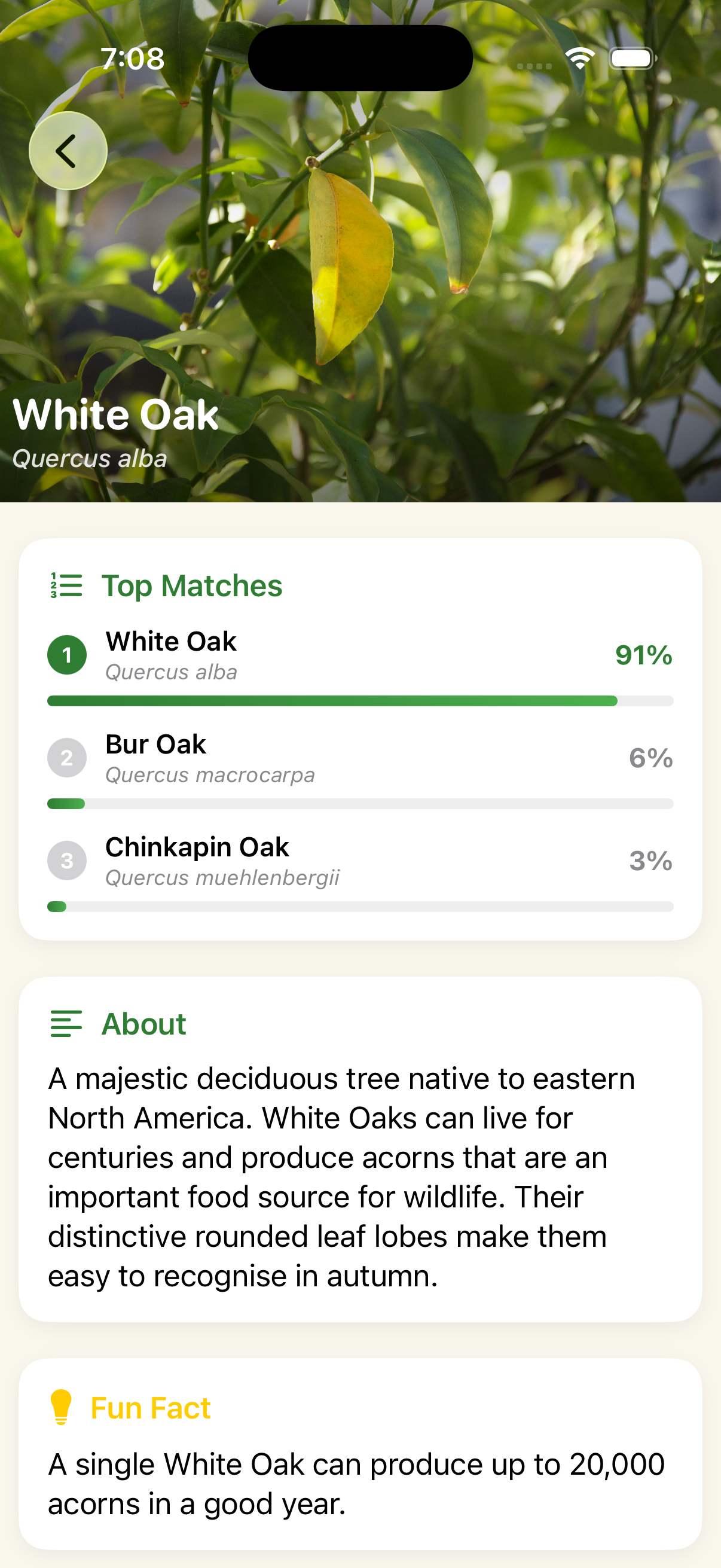
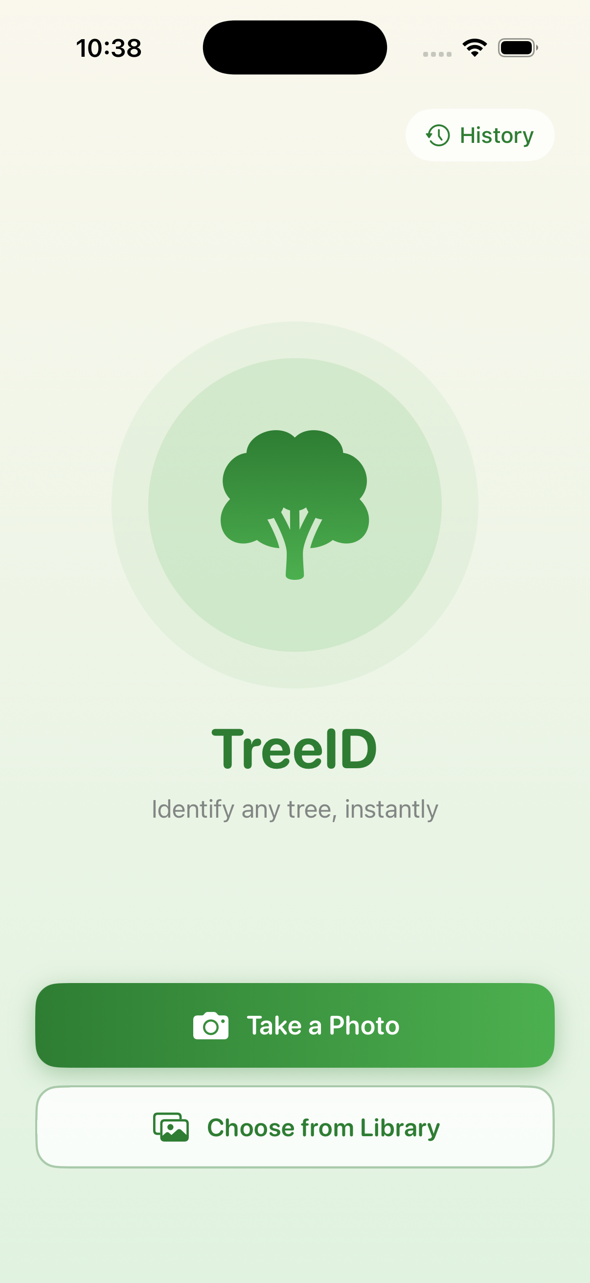
- Core flow worked: users could identify a tree without friction
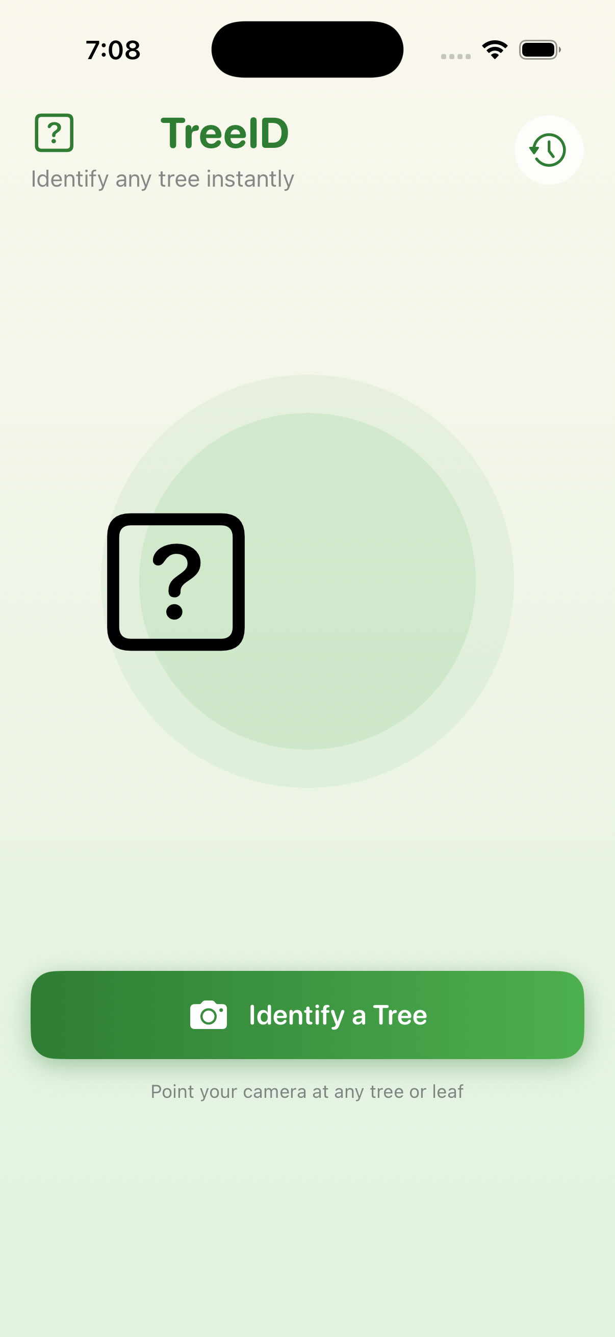
- "?" placeholder icon flagged as unfinished by all users
- Results page didn't afford scrolling — one user never found the fun fact or CTA
- Consistent ask for more depth: reference photos, tappable match cards, a habitat map
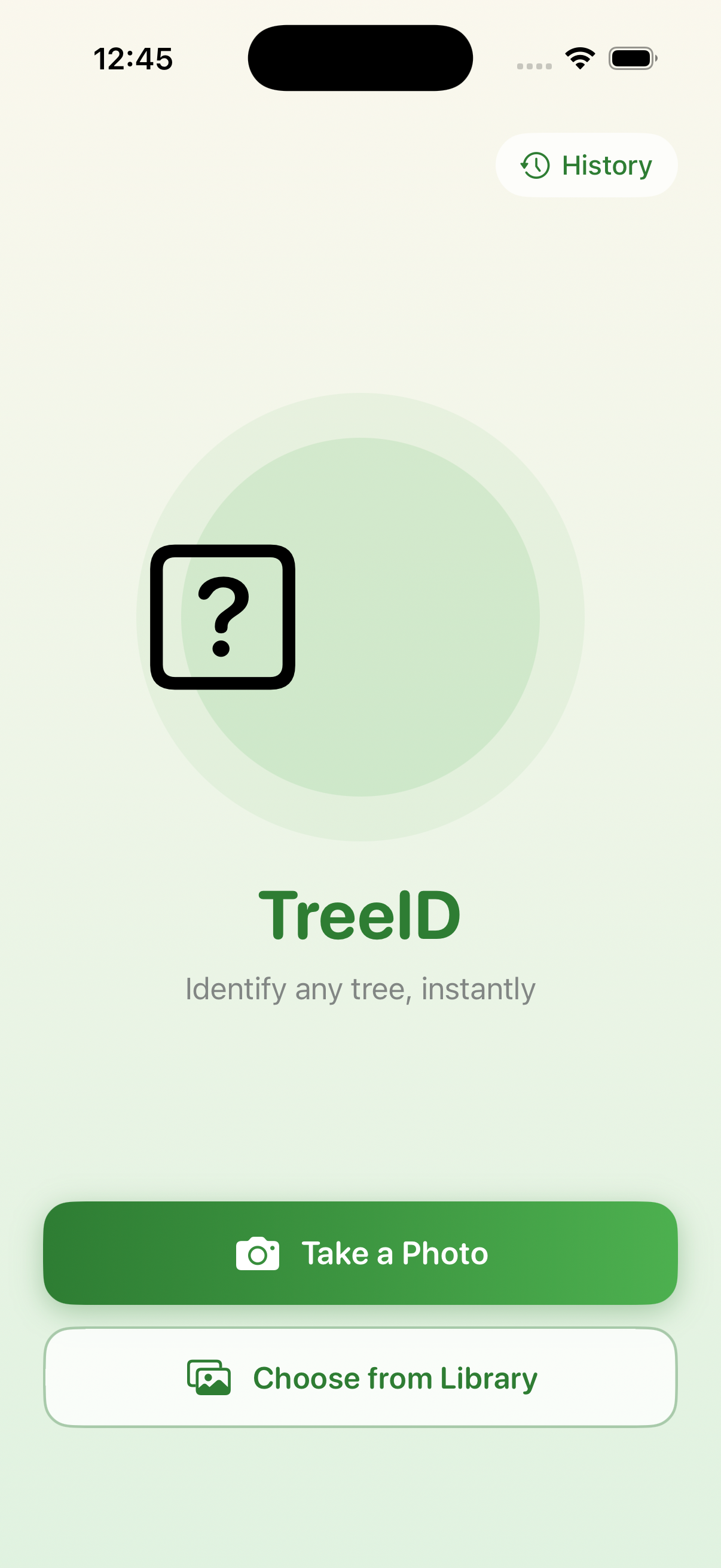
Iteration Two
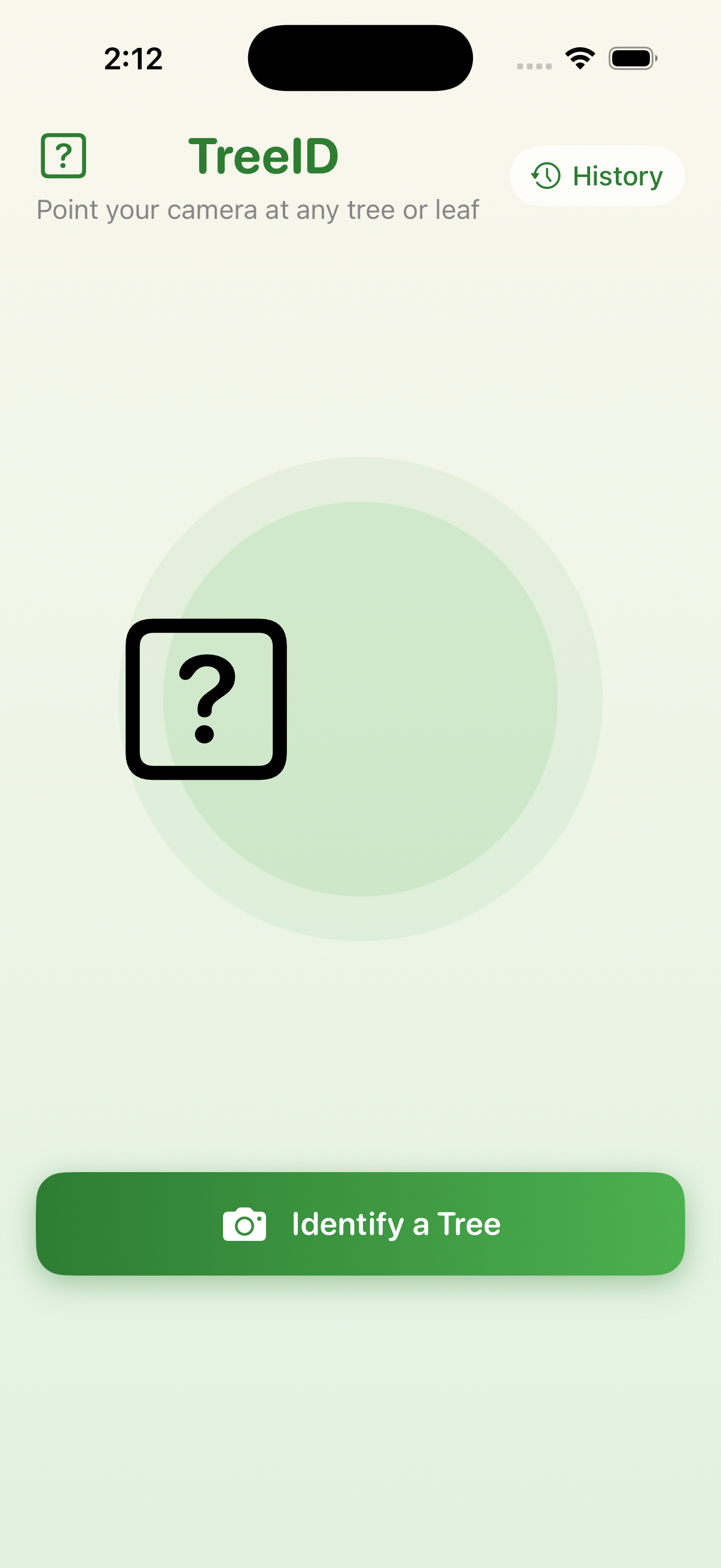
- Landing page unanimously called "funny" or unpolished
- Users kept expecting to press the main button again rather than choose from the dialog
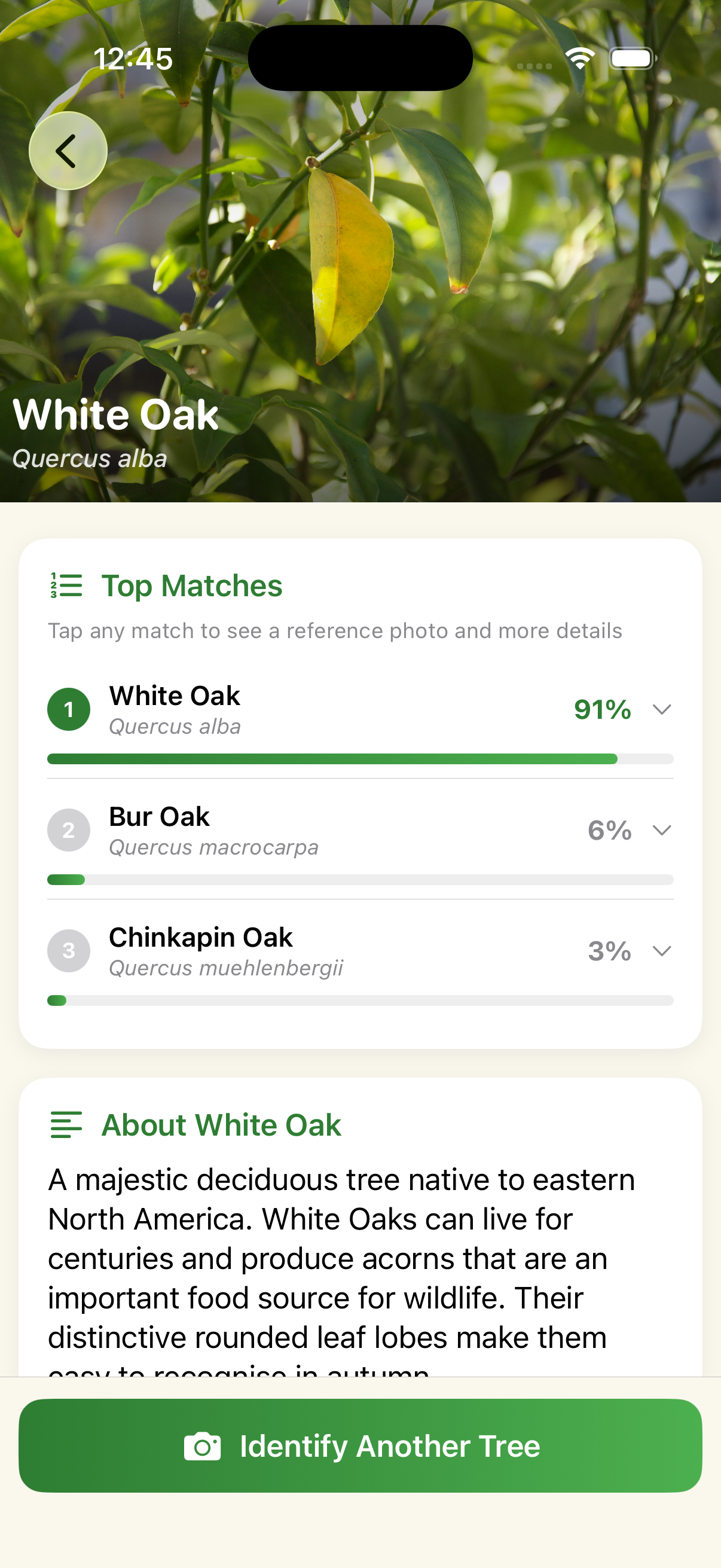
Iteration Three
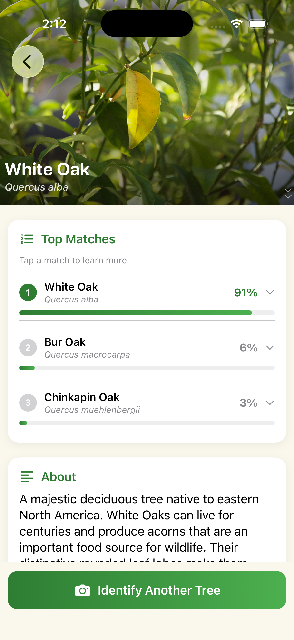
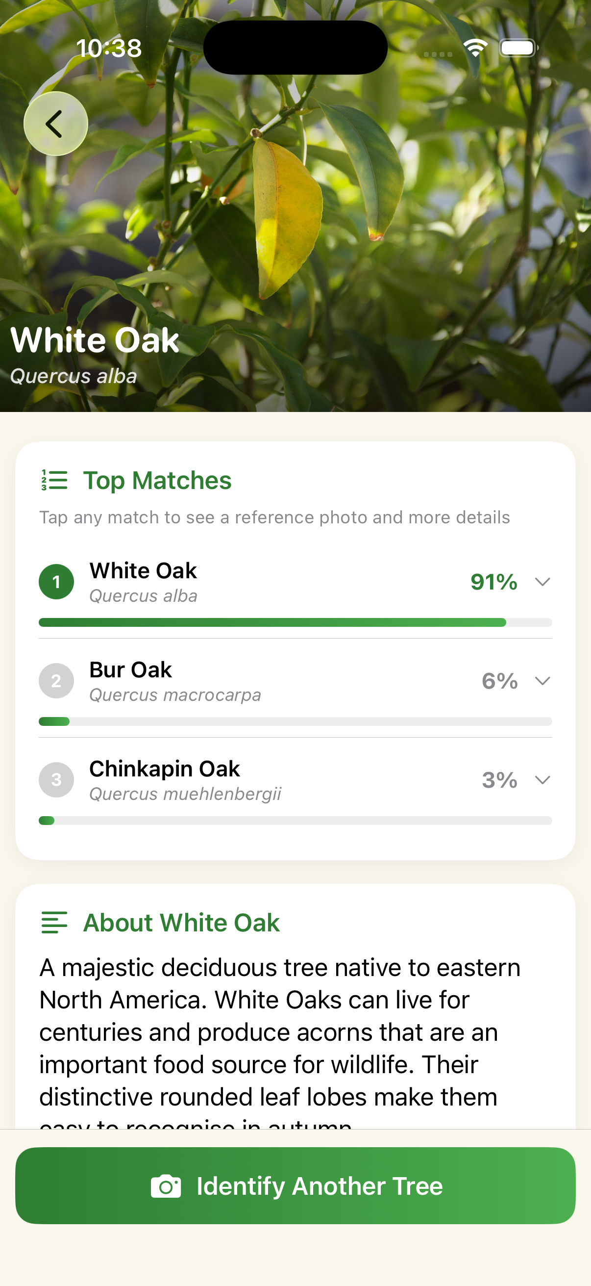
- Identify flow and results screen stopped drawing complaints, a meaningful improvement from round one
- One issue raised by all three users: a black "?" box on top of the green circle (tree emoji not rendering in the iOS simulator)
About Me
I'm a curious maker and methodical thinker.
I take a mixed-methods approach to understanding problems fully. I strive to build beautiful, functional things.
I focus on answering the right research questions and helping teams make confident decisions.
With my technical background, I'm uniquely positioned to work and collaborate cross-functionally. I'm currently experimenting with AI-assisted workflows for quant analysis, synthesis, note-taking, and prototyping. I help cross-functional teams focus on real user needs and translate research findings into product direction, roadmap priorities, and strategic decisions.
As I've grown in my role, I've taken on more teaching and mentorship.
I care deeply about creating collaborative environments where people feel supported, challenged, and able to contribute meaningfully. I've recruited and mentored 7+ teammates from Apple rotational programs, teaching them to plan, run, and present research independently.
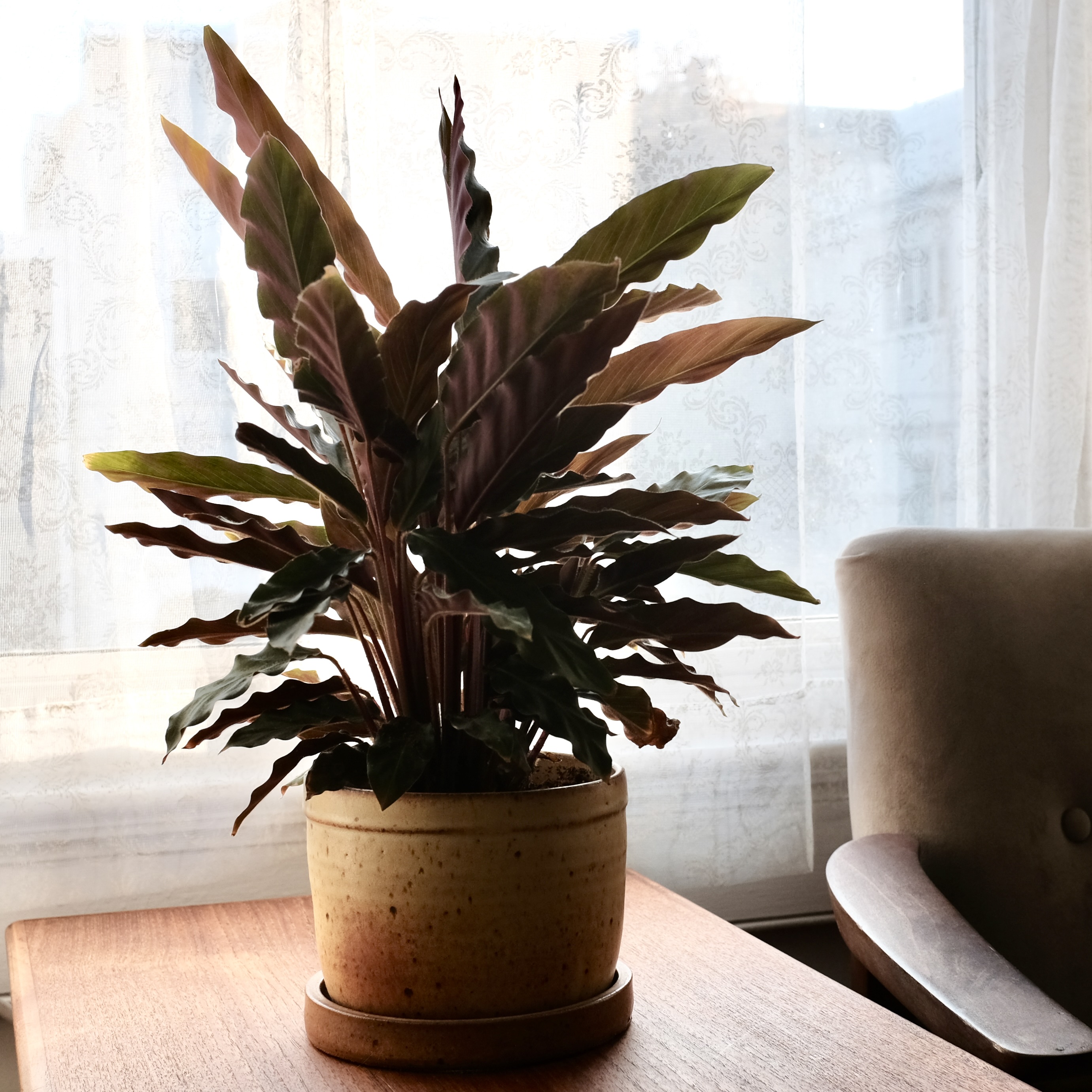
Outside of work, you'll likely find me at my ceramics studio.
I also love backpacking and rock climbing in California's mountains.
Let's connect!
I'm based in San Francisco. If you're hiring for research, want to compare notes on mixed-methods work, or just want to say hi — I'd love to hear from you.